
Design PDF signing links for people opening them on a phone
The best PDF signing flow is the one a recipient can finish without thinking about file formats, apps, or where to tap next. That means designing the link around small screens first.
Do not make recipients hunt
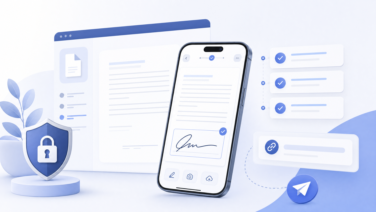
A mobile signing link should open directly to the document and guide the recipient to the next required action. If someone has to pinch around the page to find a signature line, the workflow is already leaking attention.
Progress cues, large touch targets, and a clear submit state are more important than dense toolbars.
Related Signlark tools
Try this workflow in the browser
Respect the keyboard
On phones, the keyboard can cover the document at exactly the wrong moment. Text fields should appear in a comfortable visible area, signatures should support finger input, and the interface should avoid surprise focus jumps that make the page move unexpectedly.
Confirm completion clearly
After submission, the recipient should know that the document is complete and the sender has what they need. A plain confirmation screen reduces duplicate submissions and follow-up messages.